Six homepage concepts for Toha Glass.
Each concept takes the design language of a site you liked and rebuilds it around Toha's own services, copy, reviews and project photography — same four services, same contact details, six very different personalities. Open any one full-screen and scroll; every page is responsive and complete end to end.
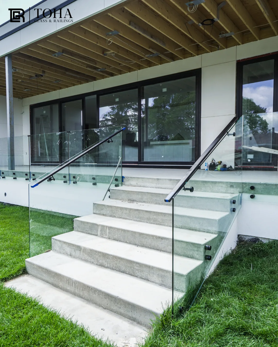
Quiet luxury
Warm off-white paper, one charcoal section, mono micro-labels and very large quiet headlines. Built out as a full multi-page site — home, about, collection, six product pages, projects, approach, showroom and contact.
Open concept →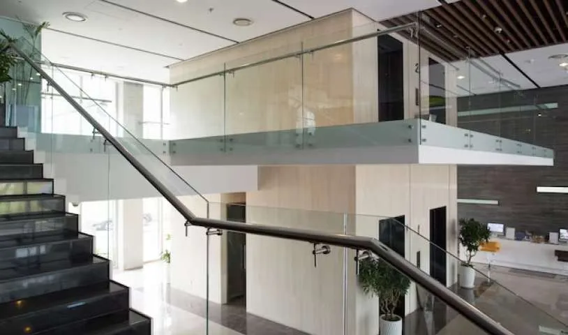
Gallery first
Centred wordmark, almost no interface, and a spine of full-width project bands. The work carries the page; type stays small, light and tracked.
Open concept →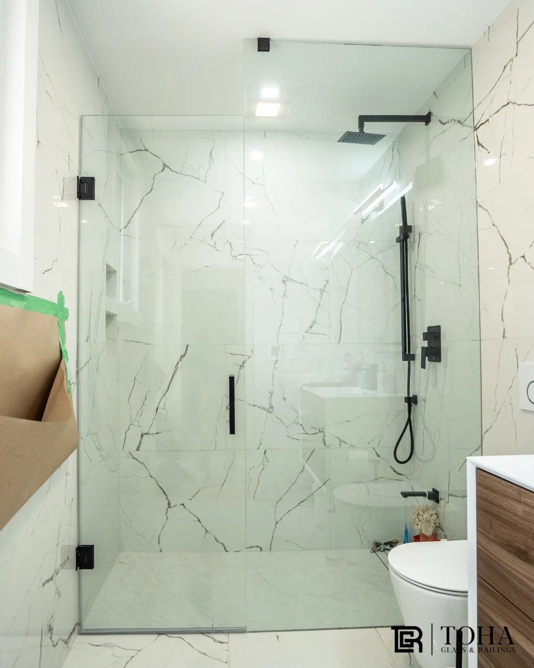
Dark showroom
Near-black catalogue with a hero slider and the four services presented as products. The most "shop the collection" of the six.
Open concept →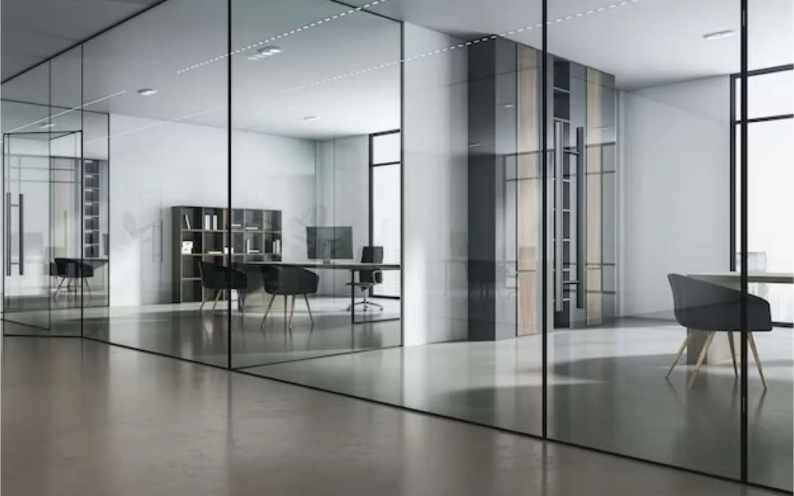
Established trade
Deep teal-green and white, full-screen header panels, ghost buttons and a credentials strip. Classic premium-contractor confidence, residential and commercial.
Open concept →
Loud and local
Heavy uppercase headlines, a signature red, service cards and a service-area list. Built to convert homeowners searching in the GTA.
Open concept →
Swiss editorial
Black and grey only, full-viewport panels, bracketed metadata and a project index that reveals photography on hover. The boldest, most design-forward option.
Open concept →Nothing invented
Every concept uses Toha's real services, about copy, Google reviews and address. Only the design language changes, so the comparison is fair.
Quote forms are inert
Each page shows a quote form but submitting is disabled — it points to and until the real estimate flow is finished.
Homepage only
These are homepage concepts. Once a direction is chosen, the inner pages — services, portfolio, contact — get built out in the same system.