
Version 1: the original six directions
The first round of concepts, kept here for reference. See Version 2 →
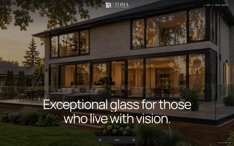
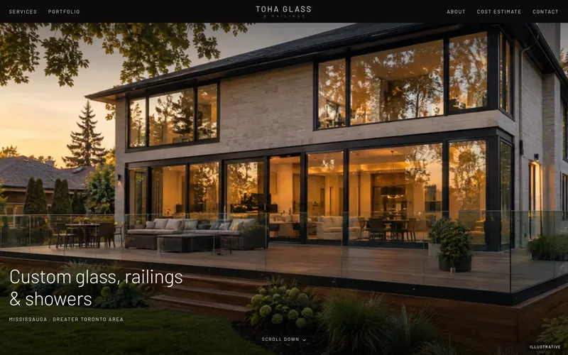
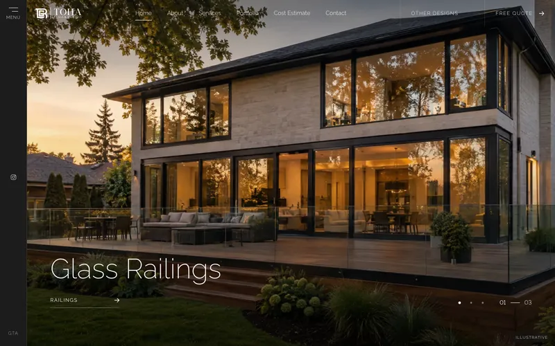
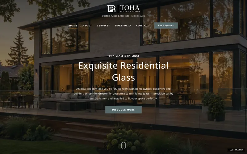
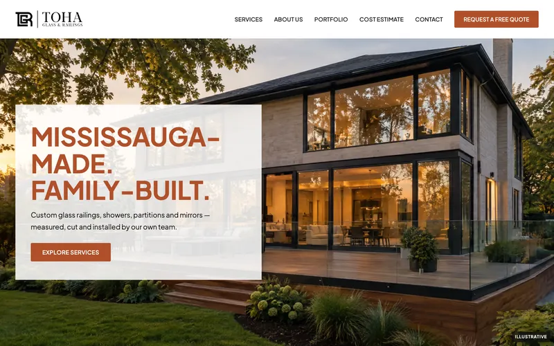
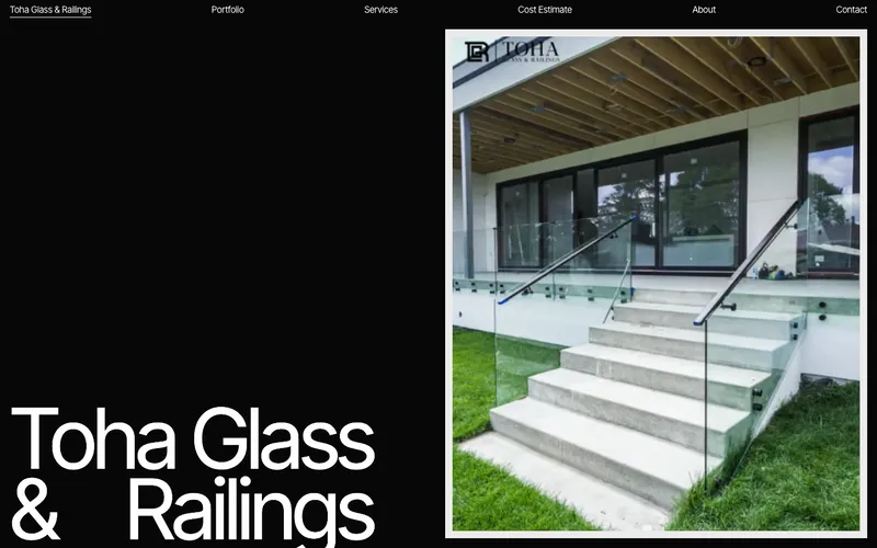
Same content and features — six different personalities
Home, About, Services + 4 service pages, Cost Estimate + 7 product estimators, Portfolio + 9 projects, Contact, 404
Pick a product, enter dimensions on a live diagram, choose glass and hardware — the full spec goes straight to
Every service system from tohaglass.com — Standoff to Base Shoe railings, six shower types, Laguna doors, wine cellars and more
Responsive AVIF/WebP images, keyboard and screen-reader friendly, reduced-motion support, 95–100 Lighthouse scores
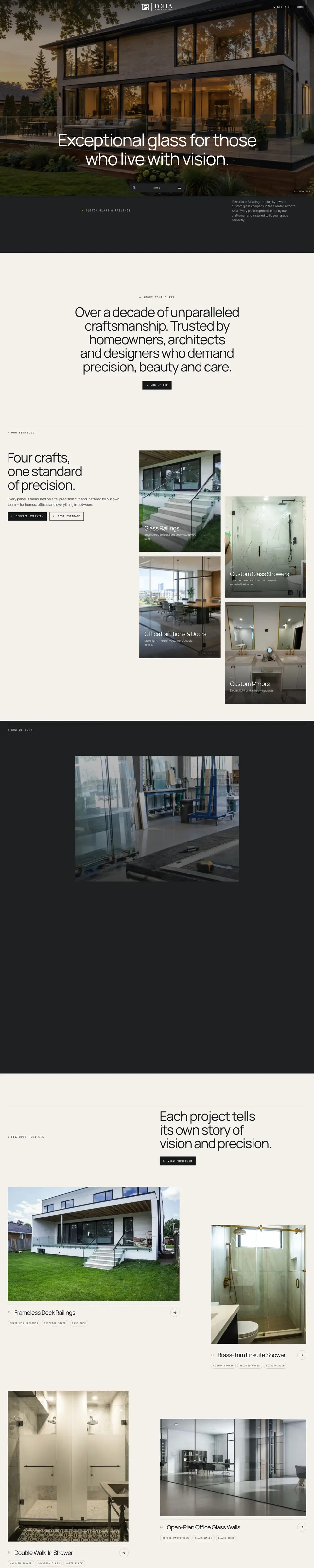
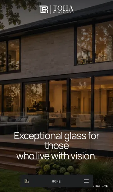
Atelier
Warm, editorial, cinematic
A calm limestone-and-brass site that unfolds like a magazine. Big quiet headlines, a cinematic hero and a workshop window that opens to full screen as you scroll.
- Floating bottom menu bar with live section label
- Workshop window expands to full bleed, process steps rise in
- Staggered service cards with photos drifting in their frames
- Full-screen photo footer with outlined wordmark
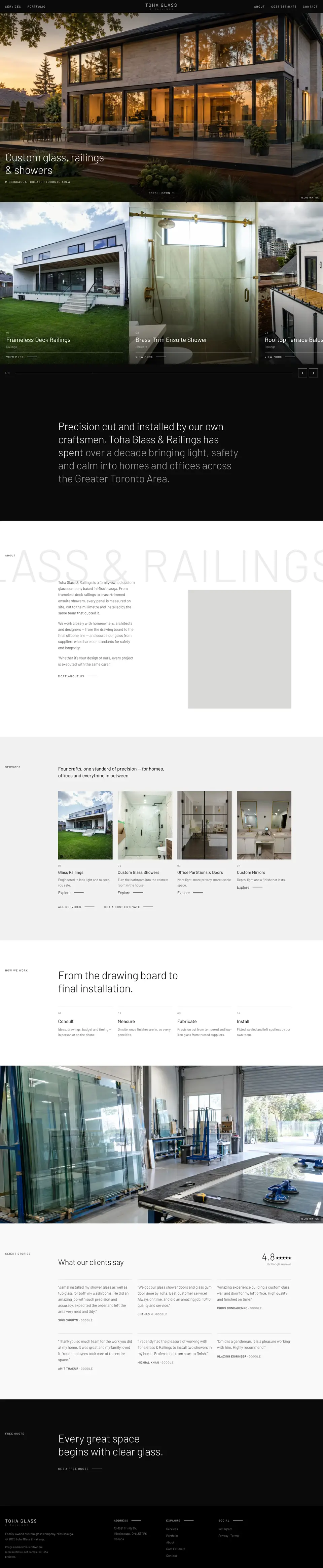
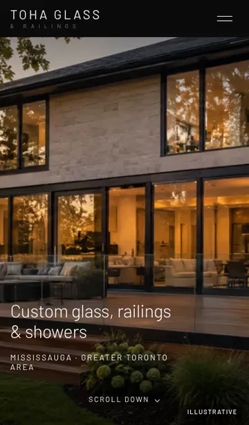
Noir
Black, minimal, confident
Gallery-like and restrained. A centred wordmark, a draggable project slider and a statement that lights up word by word as you read.
- Centred wordmark header with split navigation
- Draggable project slider with momentum, counter and progress
- Statement text fills from grey to white on scroll
- Giant pale wordmark sliding behind the About block
Studio
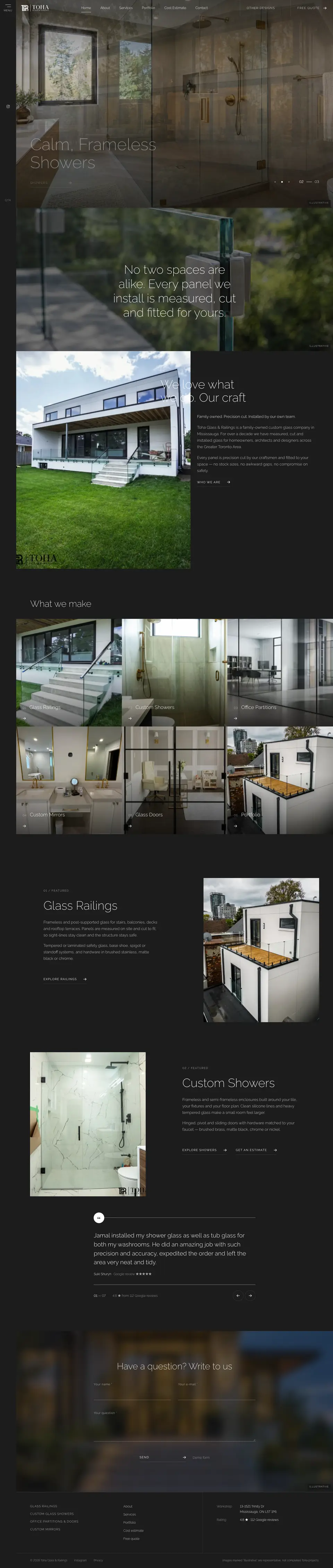
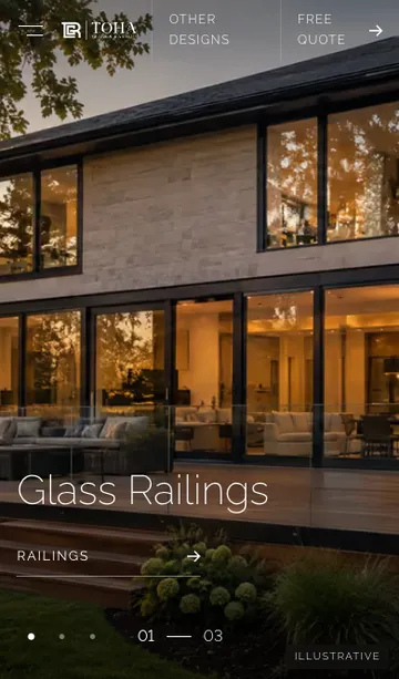
Dark, moody, photographic
A charcoal, photo-led design with a fixed side rail and a full-screen blurred menu. Thin, elegant type lets the glass do the talking.
- Fixed left rail with menu and contact icons
- Full-height hero slider with counter and slow zoom
- Edge-to-edge service tile grid
- Catalogue-style portfolio with a filter sidebar
Classic
Established, trustworthy, corporate
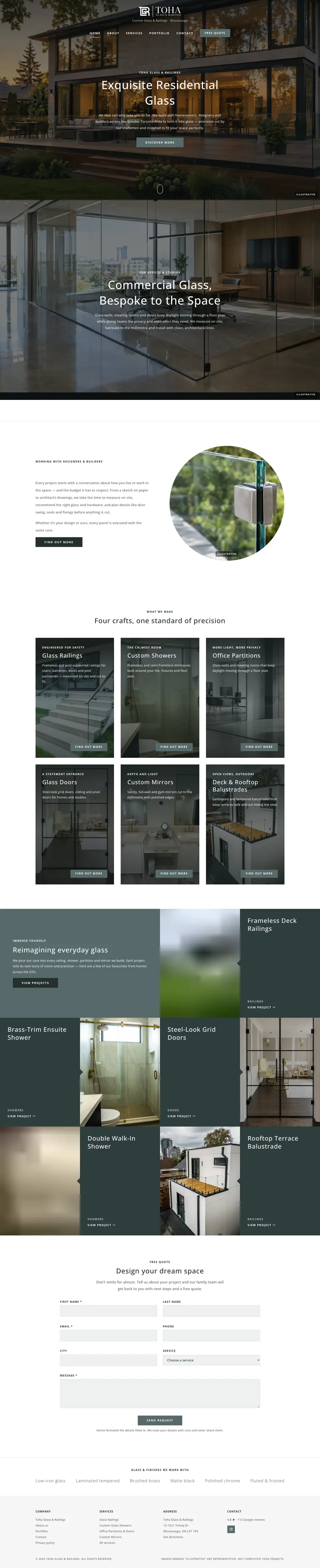
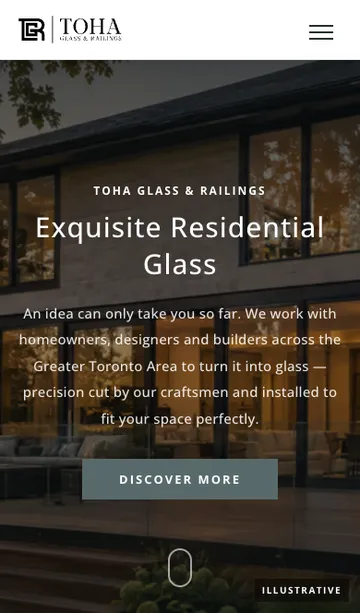
A traditional glazing-company layout that reads instantly to homeowners and builders: transparent header over a dark hero, trust strip and clear calls to action.
- Transparent header that becomes a compact bar on scroll
- Trust strip with icons dropping in
- Tall dark service cards with “Find out more”
- Checkerboard project tiles with a notch detail
Contractor
Bold, local, conversion-focused
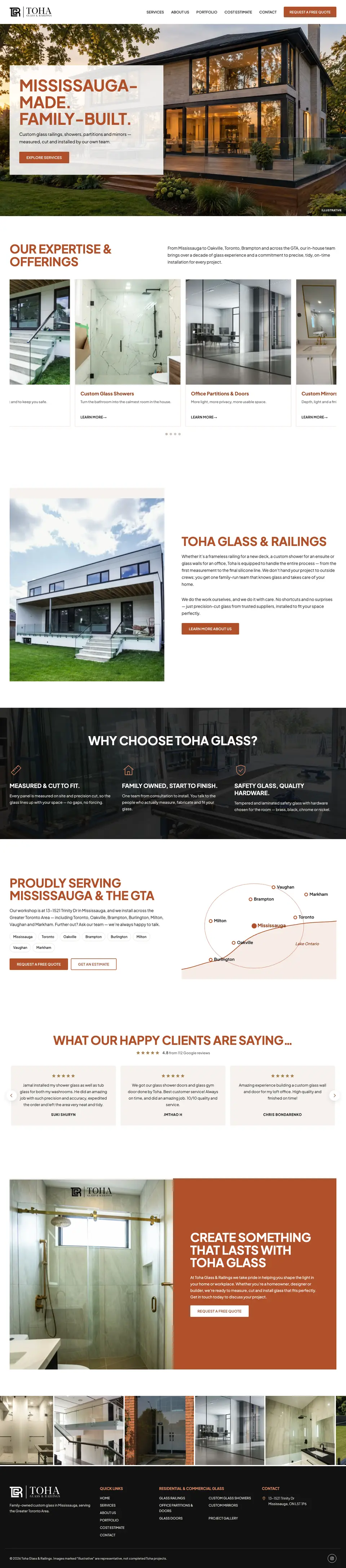
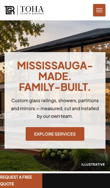
Built to turn visitors into calls. A copper accent, a GTA service-area map and a sticky call bar on phones keep the next step one tap away.
- Sticky “Call / Request a quote” bar on phones
- Auto-playing service carousel
- Animated GTA service-area map
- Testimonials carousel and photo strip
Architect
Bold, typographic, architectural
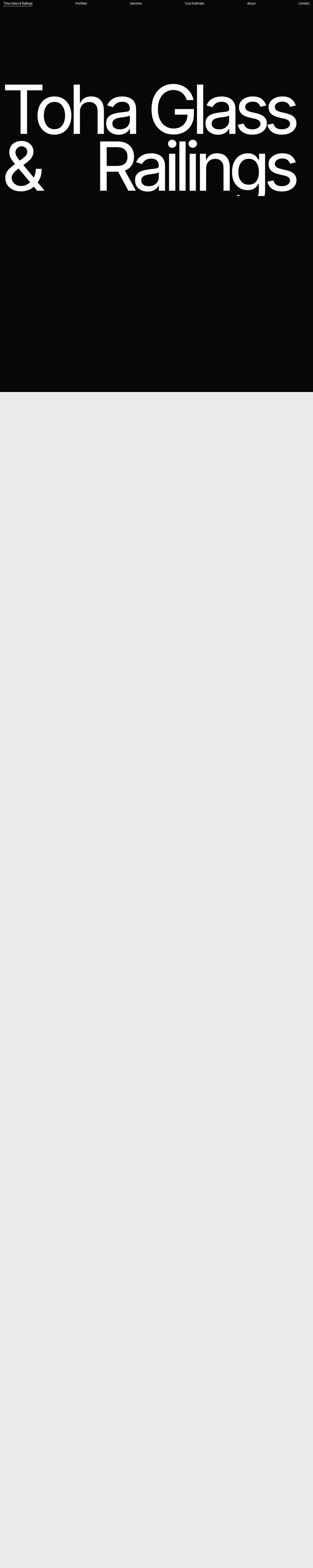
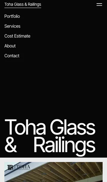
A giant two-line wordmark and a home page that moves sideways as you scroll — a statement design that feels like an architecture studio.
- Horizontal-scrolling home page on desktop
- Giant wordmark intro on first visit
- Vertical project tabs that expand
- Mono-labelled credits layout for inner pages
Compare the concepts
| Concept | Feel | Best for | Motion | Theme |
|---|---|---|---|---|
| Atelier | Warm, editorial | A premium, design-led brand | ●●●● | Light |
| Noir | Black, minimal | Letting the project photos lead | ●●● | Dark |
| Studio | Dark, moody | High-end residential and showers | ●●● | Dark |
| Classic | Established, corporate | Builders, commercial and trust | ●● | Light |
| Contractor | Bold, local | Calls and quote requests | ●● | Light |
| Architect | Typographic, bold | Standing out from competitors | ●●●●● | Light |